Would you be willing to open-source it? If not, how can you convince users that you’re safe? After all, most domestic antivirus and security software is itself the biggest scourge. How do you address the issue of user trust? This is very important.
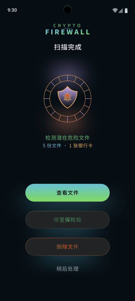
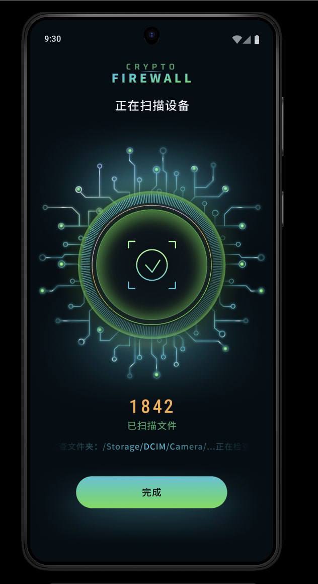
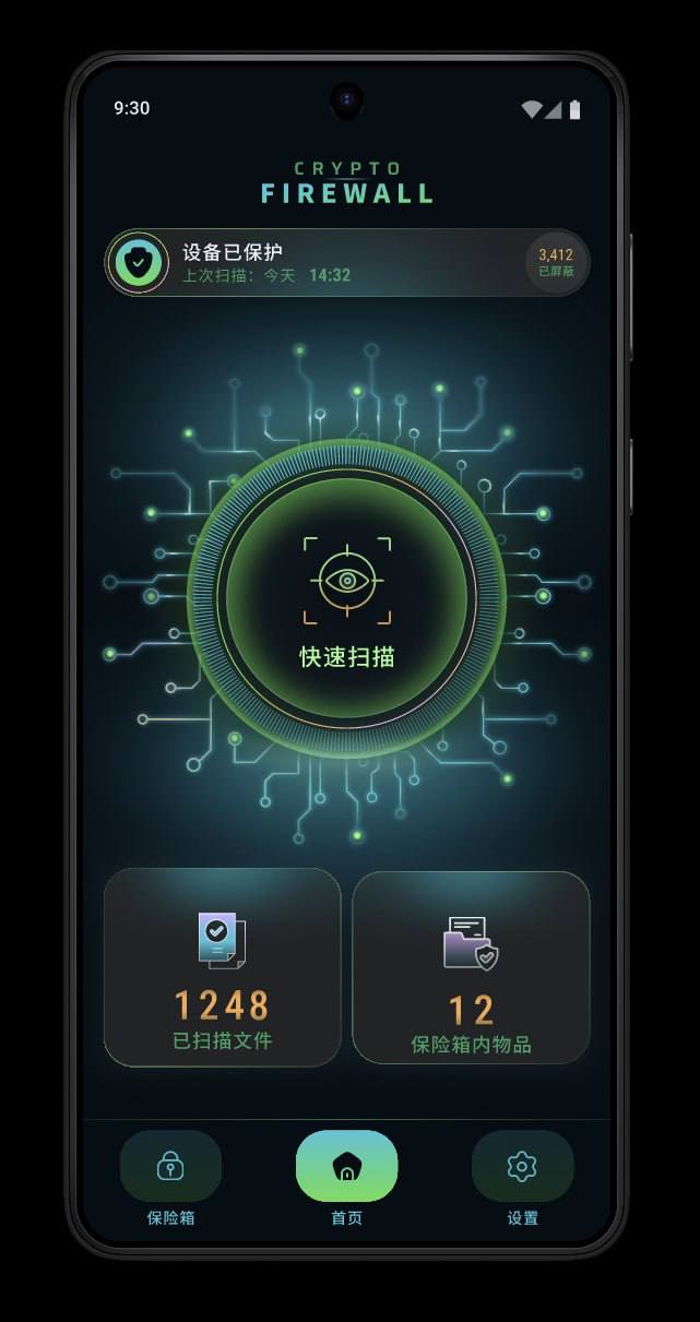
This UI/UX is, frankly, incredibly weird and shows no real sense of design—it feels far too AI-generated. If the privacy and security features are this AI-driven, it’s hard to trust them. Also, how can you convince everyone that this app isn’t recording or stealing their private data? Is the code open source? How is privacy and security guaranteed? Is the scanning logic reliable? If it’s just a mechanical, standardized scan, how is that any better or more powerful than the security features built into Android devices? iOS doesn’t need this kind of app, so why do Android users have to download an app to “protect” their supposed privacy and security?
I feel like very few people have security software installed on their phones, aside from what comes preinstalled—and on Apple devices, it’s almost impossible.
Generally, no one would be willing to use this. If they did, they’d go with an official or major-brand option. Privately made ones are fine for playing around with by yourself and with friends.
We’d love to hear some more detailed, honest feedback:
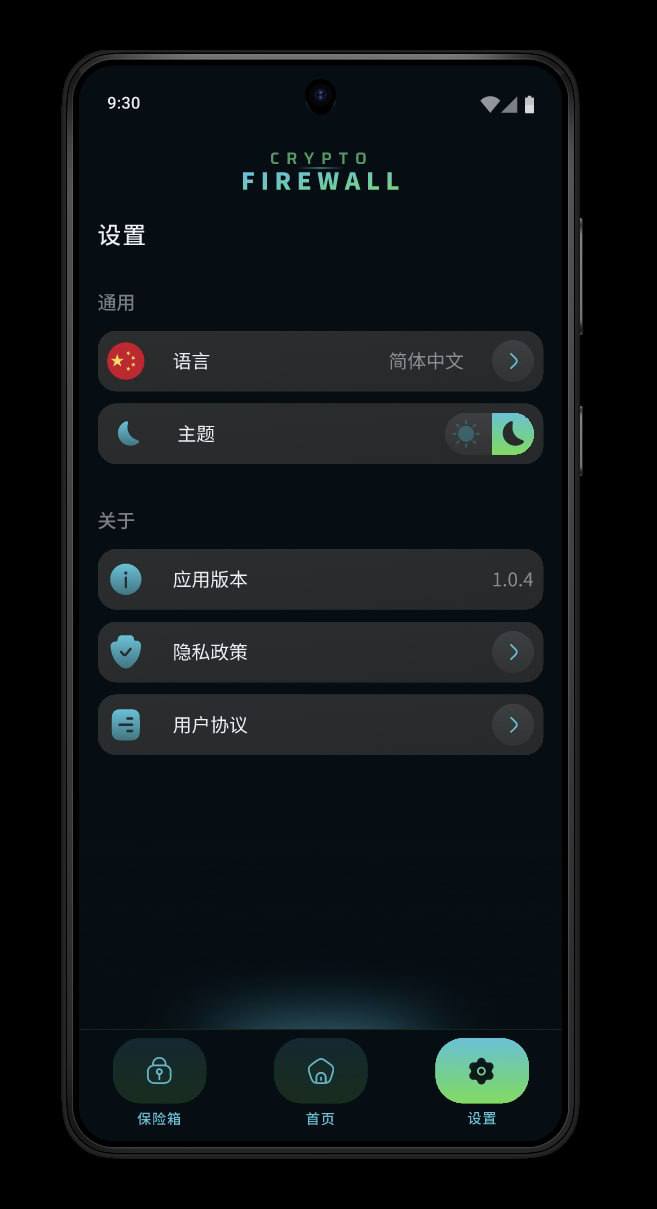
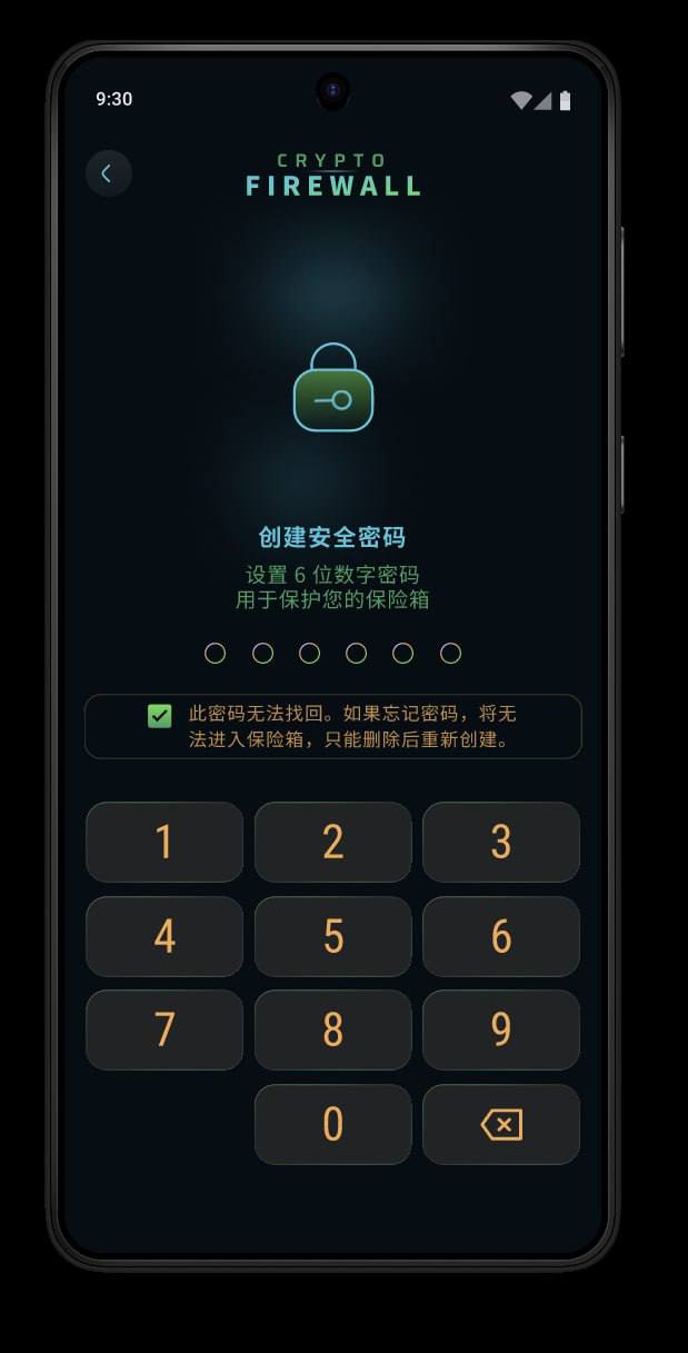
What do you think of this App’s overall design? Are the colors comfortable and harmonious? Visually, are the various features clear, intuitive, and easy to understand?
Please also feel free to point out anything you find unappealing, unreasonable, or in need of improvement. Every opinion is very helpful to us.
I’d like to ask everyone again: could you be more specific about which aspects of the current design you find unattractive, outdated, or unprofessional?
This is my first time making an app, so I really hope to do it well. I’m also happy to listen carefully to everyone’s feedback and make changes.
For example:
Color scheme: What feels inconsistent about the current colors? What kind of color scheme or style do you prefer?
Interface layout: Is the information and functionality arranged logically on the page? Are there any areas that look too cluttered, too empty, or unintuitive?
Button design: Are the buttons’ placement, size, and style convenient? Which buttons should be repositioned or made more prominent?
Overall visual design: Which aspects give you a noticeable “AI-generated” feeling or make the app look unlike a modern app? How specifically could they be improved?
If possible, I’d appreciate more detailed feedback—even direct criticism is totally fine. This is my first app, and every specific suggestion is incredibly helpful to me.
Thank you so much for taking the time to share your feedback!